Introduction
In a manufacturing line, we got a lot of defects during a process time which degrades our products and as a consequence, our quality is diminished. So in such cases, this chart proves to be helpful in many ways. We can use a Pareto chart to identify the most frequent defects, the most common causes of defects, or the most frequent causes of customer complaints. It can help to focus improvement efforts on areas where the quality improvement can be made to great extent.
What is a Pareto chart?
A Pareto chart is a special type of chart which combines both a bar graph and a line graph to represent the factors which affect the variable. Here the individual values are represented in descending order by bars and the cumulative total is represented by the line. The categories or factors symbolized by the bigger bars on the left are more important than those on the right.
The very purpose of this chart is to highlight the most important among a set of factors which is affecting the process. In quality improvement, it is represented as the most common sources of defects, most commonly occurring defects and henceforth.
For example, a telecom company wants to find out what the complaint types of customers are and which needs to resolve first. So in this case, it will be useful in prioritization the factors. Complaint types can be signal strength, hardware problems, connection failure, billing problems, wrong account details, etc.
Origin
Pareto chart was originated in the 19th century by Vilfredo Pareto. He was an Italian economist and sociologist who made an outstanding contribution in the application of mathematics in economic analysis. During his studies, he found some regularity in the personal distribution of income in different countries and he claimed that a large percentage of wealth is relatively owned by a small population ratio. Later these findings became known to us as a Pareto’s Laws (80/20 principle).
During its inception, this chart was used in the field of economics and gradually over the years, we can find its applications in many sectors. Some scenarios where we can use this chart are –
- Manufacturing process
- Research & Development
- Medical field
- Service industry
Pareto chart is simple to understand, highlights the most frequently occurring defects and used to determine priorities for quality improvement. This will be helpful to decide which subset of problems should be solved first by applying Pareto’s Law.
When to use a Pareto chart?
- Data is attribute type only.
- To identify the most frequent defects, complaints or any factor where one can categorize.
- When we want to prioritize on the most significant factors.
- Use in quality improvement process (Either on early or later stages)
Benefits
- The diagrammatic representation is simple to understand.
- It highlights the important factors in any scenarios which have a large influence in a process.
- Applications are found in many circumstances like quality control, inventory control, and so on.
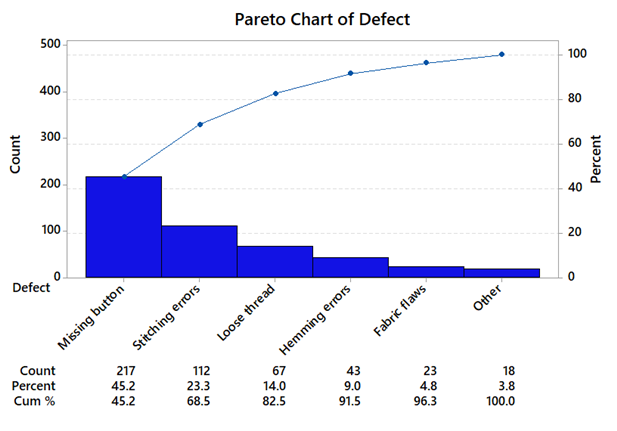
Example
Reference
An inspector of a clothing manufacturer investigates sources of clothing defects to prioritize improvement in a process. So he creates a Pareto chart to tracks the number and type of defects in the process.
Attend our Training Program, to know – “How can we achieve Quality Excellence in an Organisation?” We conduct various training programs – Statistical Training and Minitab Software Training. Some of the Statistical training certified courses are Predictive Analytics Masterclass, Essential Statistics For Business Analytics, SPC Masterclass, DOE Masterclass, etc. (Basic to Advanced Level). Some of the Minitab software training certified courses are Minitab Essentials, Statistical Tools for Pharmaceuticals, Statistical Quality Analysis & Factorial Designs, etc. (Basic to Advanced Level).
We also provide wide-ranging solutions for Enterprise Quality Management to achieve Organisational Excellence.